The Role of Color in Defining Interior Design Styles
Color is more than a design element—it's a defining factor in shaping interior design styles. This article explores how color influences the mood, functionality, and aesthetic of spaces in styles like Scandinavian, bohemian, and traditional.
More Articles


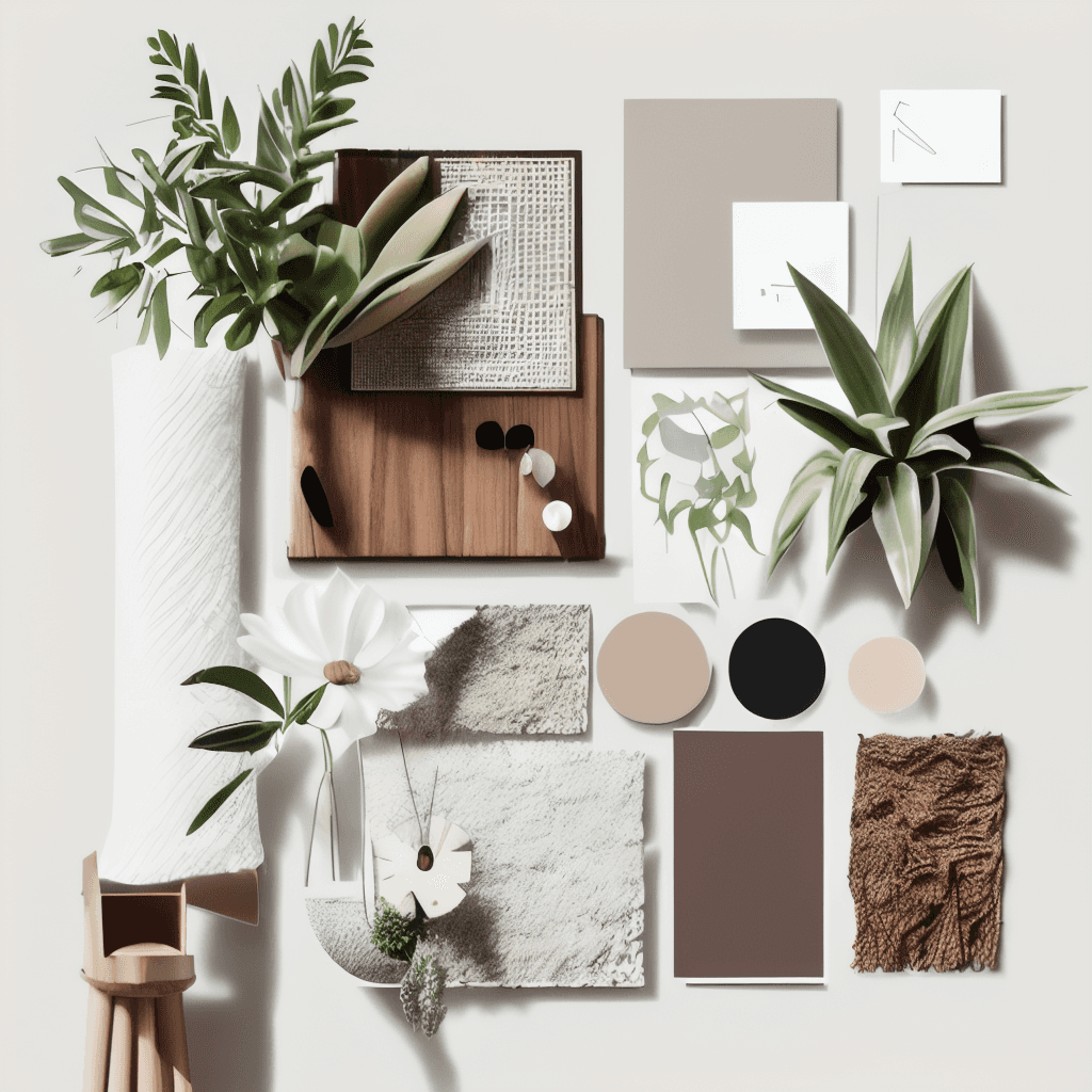
Interior design is not just about furniture or layout—it's about how every element comes together to create a cohesive, livable space. Among these elements, color takes center stage. The choice of color palettes defines interior design styles, sets the mood, and evokes emotions, making it a powerful tool for designers.
Here’s a closer look at how colors influence three popular interior design styles: Scandinavian, bohemian, and traditional.
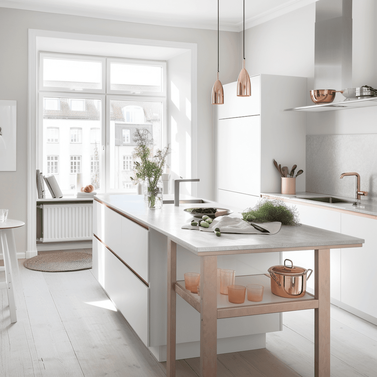
Scandinavian Design: Simplicity with Neutral Tones
Scandinavian interiors are synonymous with minimalism, functionality, and coziness. The use of a neutral color palette—whites, greys, and soft pastels—forms the foundation of this style. These shades allow natural light to bounce across the space, creating a sense of openness and calm.
In Scandinavian design:
White walls are often paired with natural wood tones.
Pastel accents—such as mint green or blush pink—add subtle warmth.
Greys and beiges provide balance without overwhelming the space.
The result? A clean, uncluttered look that feels serene and welcoming.
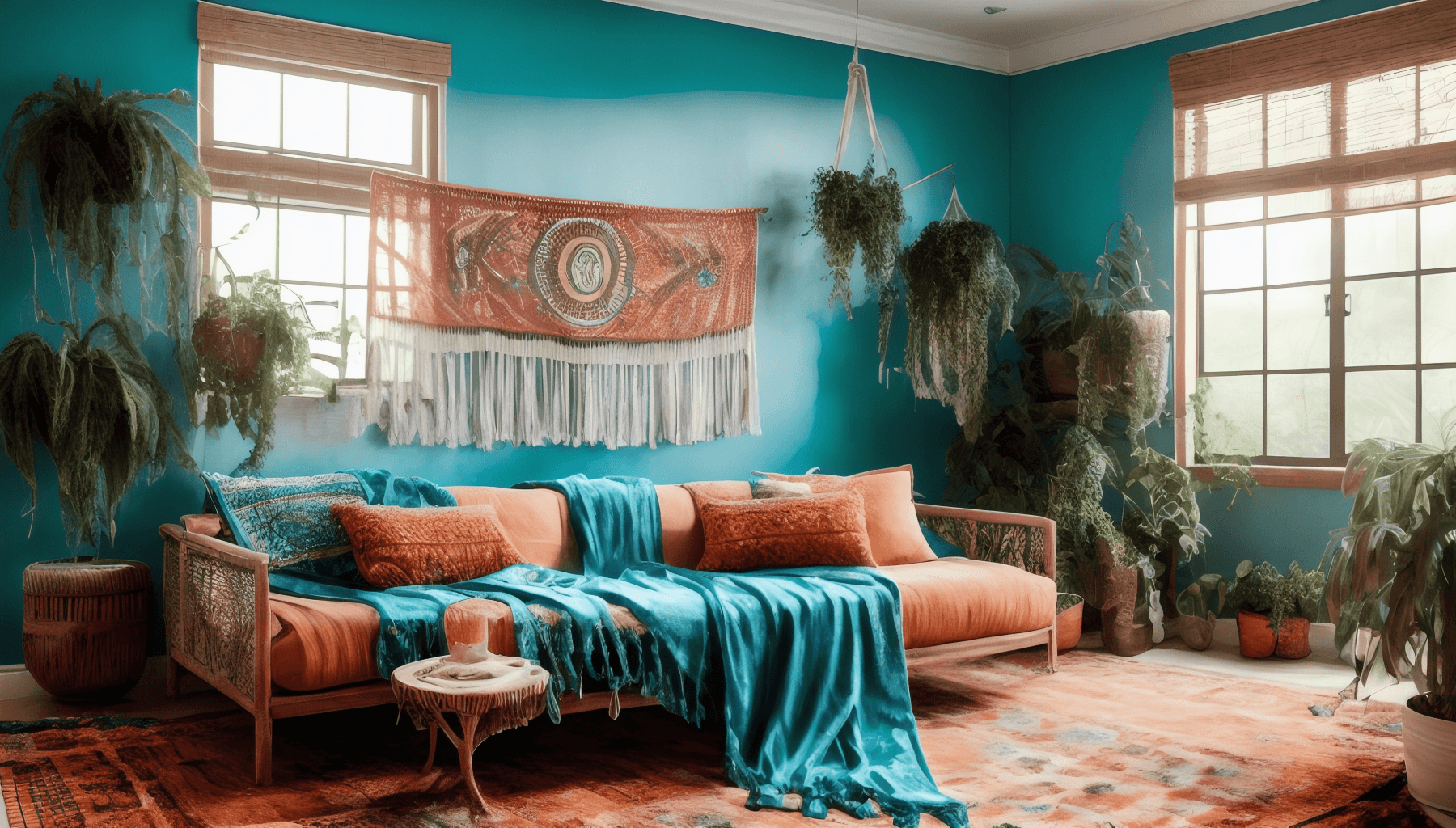
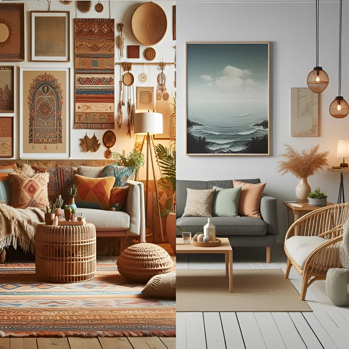
Bohemian Style: A Celebration of Bold Hues
Bohemian interiors thrive on an eclectic mix of colors and patterns. This style is all about individuality and artistic expression, where rich, bold hues dominate. Think vibrant oranges, deep blues, earthy reds, and lush greens.
To achieve a bohemian aesthetic:
Layer colors and patterns freely—such as a teal sofa paired with an orange rug.
Add pops of color with decorative pillows, throws, and wall art.
Incorporate natural materials like rattan or wood to ground the vibrant palette.
Bohemian design embraces imperfection, making it the perfect canvas for vibrant creativity.
Traditional Interiors: Elegance in Muted Shades
Traditional design leans heavily on timeless, muted color schemes that exude elegance and sophistication. Colors like cream, taupe, and soft blues are staples in this style. These hues complement classic furnishings and ornate detailing, such as crown moldings or decorative trims.
In traditional interiors:
Rich wood tones and muted shades work together harmoniously.
Neutral backgrounds allow statement pieces like a patterned armchair or gilded mirror to shine.
Add depth with layered textures—such as velvet curtains or woven rugs.
The use of color in traditional design is subtle yet impactful, creating a sense of luxury and refinement.
How to Choose the Right Color Palette for Your Style
When designing a space, your color palette should reflect the desired style and mood of the room. Ask yourself:
What mood do you want to create? (Calm, vibrant, or classic?)
Which colors make you feel most at home?
How will natural and artificial lighting affect the colors?
By thoughtfully selecting colors, you can elevate the design and functionality of your space.
Final Thoughts
Color is more than just a visual choice—it’s a defining element that brings interior design styles to life. From the crisp neutrals of Scandinavian design to the bold vibrancy of bohemian aesthetics and the muted elegance of traditional interiors, the right palette can transform any space into a harmonious and inspiring environment.
Let the power of color inspire your next design project, and remember: the right hue is the one that feels just right for you.


Rabiraj Kannan
Rabi is the creative guy behind Oddworks, an architectural studio known for its innovative and personalized approach to design. He blends modern and timeless architectural elements to create spaces that reflect the personality and lifestyle of their inhabitants. His work combines artistic vision with practical solutions, ensuring each project is both inspiring and enduring.
Similar Topic


